
If, you have x and y numeric or one of them a categorical dataset. You want to find the relationship between x and y to getting insights. Then the seaborn scatter plot function sns.scatterplot() will help.
Along with sns.scatterplot() function, seaborn have multiple functions like sns.lmplot(), sns.relplot(), sns.pariplot(). But sns.scatterplot() is the best way to create sns scatter plot.
Bonus:
1. Jupyter NoteBook file for download which contains all practical source code explained here.
2. 4 examples with 2 different dataset
What is seaborn scatter plot and Why use it?
The seaborn scatter plot use to find the relationship between x and y variable. It may be both a numeric type or one of them a categorical data. The main goal is data visualization through the scatter plot.
To get insights from the data then different data visualization methods usage is the best decision. Up to, we learn in python seaborn tutorial. How to create a seaborn line plot, histogram, barplot? So, maybe you definitely observe these methods are not sufficient.
How to create a seaborn scatter plot using sns.scatterplot() function?
To create a scatter plot use sns.scatterplot() function. In this tutorial, we will learn how to create a sns scatter plot step by step. Here, we use multiple parameters, keyword arguments, and other seaborn and matplotlib functions.
Syntax: sns.scatterplot(
x=None,
y=None,
hue=None,
style=None,
size=None,
data=None,
palette=None,
hue_order=None,
hue_norm=None,
sizes=None,
size_order=None,
size_norm=None,
markers=True,
style_order=None,
x_bins=None,
y_bins=None,
units=None,
estimator=None,
ci=95,
n_boot=1000,
alpha=’auto’,
x_jitter=None,
y_jitter=None,
legend=’brief’,
ax=None,
**kwargs,
)
For the best understanding, I suggest you follow the matplotlib scatter plot tutorial.
Import libraries
As you can see, we import the Seaborn and Matplotlib pyplot module for data visualization.
Note: Practical perform on Jupyter NoteBook and at the end of this seaborn scatter plot tutorial, you will get ‘.ipynb‘ file for download.
# Import libraries
import seaborn as sns # for Data visualization
import matplotlib.pyplot as plt # for Data visualization

#It used only for read_csv in this tutorial
import pandas as pd # for data analysis
- sns: Short name was given to seaborn
- plt: Short name was given to matplolib.pyplot module
Import Dataset
Here, we are importing or loading “titanic.csv” dataset from GitHub Seaborn repository using sns.load_dataset() function but you can import your business dataset using Pandas read_csv function.
#Import dataset from GitHub Seborn Repository
titanic_df = sns.load_dataset("titanic")
titanic_df # call titanic DataFrame
or
# Import dataset from local folder using pandas read_csv function
titanic_df = pd.read_csv("C:\\Users\\IndianAIProduction\\seaborn-data\\titanic.csv")
titanic_df # call titanic DataFrame
Output >>>

What is Titanic DataFrame?
I hope, you watched Titanic historical Hollywood movie. Titanic was a passenger ship which crashed. The “titanic.csv” contains all the information about that passenger.
The ‘titanic.csv’ DataFrame contains 891 rows and 15 columns. Using this DataFrame our a goal to scatter it first using seaborn sns.scatterplot() function and find insights.
Note: In this tutorial, we are not going to clean ‘titanic’ DataFrame but in real life project, you should first clean it and then visualize.
Plot seaborn scatter plot using sns.scatterplot() x, y, data parameters
Create a scatter plot is a simple task using sns.scatterplot() function just pass x, y, and data to it. you can follow any one method to create a scatter plot from given below.
1. Method
# Draw Seaborn Scatter Plot to find relationship between age and fare
sns.scatterplot(x = "age", y = "fare", data = titanic_df)
2. Method
# Draw Seaborn Scatter Plot to find relationship between age and fare
sns.scatterplot(x = titanic_df.age, y = titanic_df.fare)
3. Method
# Draw Seaborn Scatter Plot to find relationship between age and fare
sns.scatterplot(x = titanic_df['age'], y = titanic_df['fare'])
Output >>>

- x, y: Pass value as a name of variables or vector from DataFrame, optional
- data: Pass DataFrame
sns.scatterplot() hue parameter
- hue: Pass value as a name of variables or vector from DataFrame, optional
To distribute x and y variables with a third categorical variable using color.
# scatter plot hue parameter
sns.scatterplot(x = "age", y = "fare", data = titanic_df, hue = "sex")
output >>>

sns.scatterplot() hue_order parameter
- hue_order: Pass value as a tuple or Normalize object, optional
As you can observe in above scatter plot, we used the hue parameter to distribute scatter plot in male and female. The order of that hue in this manner [‘male’, ‘female’] but your requirement is [‘female’, ‘male’]. Then hue_order parameter will help to change hue categorical data order.
# scatter plot hue_order parameter
sns.scatterplot(x = "age", y = "fare", data = titanic_df, hue = "sex",
               hue_order= ['female', 'male'])
output >>>

sns.scatterplot() size parameter
- size: Pass value as a name of variables or vector from DataFrame, optional
Its name tells us why to use it, to distribute scatter plot in size by passing the categorical or numeric variable.
# scatter plot size parameter
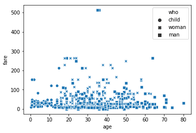
sns.scatterplot(x = "age", y = "fare", data = titanic_df, size = "who")
output >>>

sns.scatterplot() sizes parameter
- sizes: Pass value as a list, dict, or tuple, optional
To minimize and maximize the size of the size parameter.
# scatter plot sizes parameter
sns.scatterplot(x = "age", y = "fare", data = titanic_df, size = "who",
                sizes = (50, 300))
output >>>

sns.scatterplot() size_order parameter
- size_order: Pass value as a list, optional
Same like hue_order size_order parameter change the size order of size variable. Current size order is [‘man’, ‘woman’, ‘child’] now we change like [‘child’, ‘man’, ‘woman’].
# scatter plot size_order parameter
sns.scatterplot(x = "age", y = "fare", data = titanic_df, size = "who",
                size_order=['child', 'man', 'woman'],)
output >>>

sns.scatterplot() style parameter
- style: Pass value as a name of variables or vector from DataFrame, optional
To change the style with a different marker.
# scatter plot style parameter
sns.scatterplot(x = "age", y = "fare", data = titanic_df, style = "who",)
Output >>>

sns.scatterplot() style_order parameter
- style_order: Pass value as a list, optional
Like hue_order, size_order, style_order parameter change the order of style levels. Here, we changed the style order [‘man’, ‘woman’, ‘child’] to [‘child’,’woman’,’man’].
# scatter plot style_order parameter
sns.scatterplot(x = "age", y = "fare", data = titanic_df, style = "who", style_order=['child','woman','man'])
Output >>>
sns.scatterplot() palette parameter
- palette: Pass value as a palette name, list, or dict, optional
To change the color of the seaborn scatterplot. While using the palette, first mention hue parameter. Here, we pass the hot value to the scatter plot palette parameter.
# scatter plot palette parameter
sns.scatterplot(x = "age", y = "fare", data = titanic_df, hue = "sex",
                palette="hot") # palette does not work without hue
Palette values: Choose one of them
Possible values are: Accent, Accent_r, Blues, Blues_r, BrBG, BrBG_r, BuGn, BuGn_r, BuPu, BuPu_r, CMRmap, CMRmap_r, Dark2, Dark2_r, GnBu, GnBu_r, Greens, Greens_r, Greys, Greys_r, OrRd, OrRd_r, Oranges, Oranges_r, PRGn, PRGn_r, Paired, Paired_r, Pastel1, Pastel1_r, Pastel2, Pastel2_r, PiYG,
 PiYG_r, PuBu, PuBuGn, PuBuGn_r, PuBu_r, PuOr, PuOr_r, PuRd, PuRd_r, Purples, Purples_r, RdBu, RdBu_r, RdGy, RdGy_r, RdPu, RdPu_r, RdYlBu, RdYlBu_r, RdYlGn, RdYlGn_r, Reds, Reds_r, Set1, Set1_r, Set2, Set2_r, Set3, Set3_r, Spectral, Spectral_r, Wistia, Wistia_r, YlGn, YlGnBu, YlGnBu_r,
 YlGn_r, YlOrBr, YlOrBr_r, YlOrRd, YlOrRd_r, afmhot, afmhot_r, autumn, autumn_r, binary, binary_r, bone, bone_r, brg, brg_r, bwr, bwr_r, cividis, cividis_r, cool, cool_r, coolwarm, coolwarm_r, copper, copper_r, cubehelix, cubehelix_r, flag, flag_r, gist_earth, gist_earth_r, gist_gray, gist_gray_r,
 gist_heat, gist_heat_r, gist_ncar, gist_ncar_r, gist_rainbow, gist_rainbow_r, gist_stern, gist_stern_r, gist_yarg, gist_yarg_r, gnuplot, gnuplot2, gnuplot2_r, gnuplot_r, gray, gray_r, hot, hot_r, hsv, hsv_r, icefire, icefire_r, inferno, inferno_r, jet, jet_r, magma, magma_r, mako,
 mako_r, nipy_spectral, nipy_spectral_r, ocean, ocean_r, pink, pink_r, plasma, plasma_r, prism, prism_r, rainbow, rainbow_r, rocket, rocket_r, seismic, seismic_r, spring, spring_r, summer, summer_r, tab10, tab10_r, tab20, tab20_r, tab20b, tab20b_r, tab20c, tab20c_r, terrain, terrain_r,
 twilight, twilight_r, twilight_shifted, twilight_shifted_r, viridis, viridis_r, vlag, vlag_r, winter, winter_r
Output >>>

sns.scatterplot() markers parameter
- markers: Pass value as a boolean, list, or dictionary, optional
Use to change the marker of style categories. Below is the list of matplotlib.markers.
============================== ====== ==============================
marker                         symbol description
============================== ====== ==============================
``"."``                        |m00|  point
``","``                        |m01|  pixel
``"o"``                        |m02|  circle
``"v"``                        |m03|  triangle_down
``"^"``                        |m04|  triangle_up
``"<"``                        |m05|  triangle_left
``">"``                        |m06|  triangle_right
``"1"``                        |m07|  tri_down
``"2"``                        |m08|  tri_up
``"3"``                        |m09|  tri_left
``"4"``                        |m10|  tri_right
``"8"``                        |m11|  octagon
``"s"``                        |m12|  square
``"p"``                        |m13|  pentagon
``"P"``                        |m23|  plus (filled)
``"*"``                        |m14|  star
``"h"``                        |m15|  hexagon1
``"H"``                        |m16|  hexagon2
``"+"``                        |m17|  plus
``"x"``                        |m18|  x
``"X"``                        |m24|  x (filled)
``"D"``                        |m19|  diamond
``"d"``                        |m20|  thin_diamond
``"|"``                        |m21|  vline
``"_"``                        |m22|  hline
``0`` (``TICKLEFT``)           |m25|  tickleft
``1`` (``TICKRIGHT``)          |m26|  tickright
``2`` (``TICKUP``)             |m27|  tickup
``3`` (``TICKDOWN``)           |m28|  tickdown
``4`` (``CARETLEFT``)          |m29|  caretleft
``5`` (``CARETRIGHT``)         |m30|  caretright
``6`` (``CARETUP``)            |m31|  caretup
``7`` (``CARETDOWN``)          |m32|  caretdown
``8`` (``CARETLEFTBASE``)      |m33|  caretleft (centered at base)
``9`` (``CARETRIGHTBASE``)     |m34|  caretright (centered at base)
``10`` (``CARETUPBASE``)       |m35|  caretup (centered at base)
``11`` (``CARETDOWNBASE``)     |m36|  caretdown (centered at base)
``"None"``, ``" "`` or  ``""``        nothing
``'$...$'``                    |m37|  Render the string using mathtext.
                                      E.g ``"$f$"`` for marker showing the
                                      letter ``f``.
# scatter plot markers parameter
sns.scatterplot(x = "age", y = "fare", data = titanic_df, style = "who", markers= ['3','1',3])
Output >>>

sns.scatterplot() alpha parameter
- alpha: Pass a float value between 0 to 1
To change the transparency of points. 0 value means full transparent point and 1 value means full clear. For nonvisibility pass 0 value to scatter plot alpha parameter. Here, we pass the 0.4 float value.
# scatter plot alpha parameter
sns.scatterplot(x = "age", y = "fare", data = titanic_df, alpha = 0.4)
Output >>>

sns.scatterplot() legend parameter
- legend: Pass value as “full”, “brief” or False, optional
When we used hue, style, size the scatter plot parameters then by default legend apply on it but you can change. Here, we don’t want to show legend, so we pass False value to scatter plot legend parameter.
# scatter plot legend parameter
sns.scatterplot(x = "age", y = "fare", data = titanic_df, hue = "sex", legend = False )
Output >>>

sns.scatterplot() ax (Axes) parameter
- ax (Axes): Pass value as a matplotlib Axes, optional
Use multiple methods to change the sns scatter plot format and style using the seaborn scatter plot ax (Axes) parameter. here, used ax.set() method to change the scatter plot x-axis, y-axis label, and title.
ax = sns.scatterplot(x = "age", y = "fare", data = titanic_df, )

ax.set(xlabel = "Age",
      ylabel = "Fare",
      title = "Seaborn Scatter Plot of Age and Fare")
Output >>>

sns.scatterplot() kwargs (Keyword Arguments) parameter
- kwargs (Keyword Arguments): Pass the key and value mapping as a dictionary
If you want to the artistic look of scatter plot then you must have to use the seaborn scatter plot kwargs (keyword arguments). The seaborn sns.scatterplot() allow all kwargs of matplotlib plt.scatter() like:
- edgecolor: Change the edge color of the scatter point. Pass value as a color code, name or hex code.
- facecolor: Change the face (point) color of the scatter plot. Pass value as a color code, name or hex code.
- linewidth: Change line width of scatter plot. Pass float or int value
- linestyle: Change the line style of the scatter plot. Pass line style has given below in the table.
Color Parameter Values
| Character | Color |
| b | blue |
| g | green |
| r | red |
| c | cyan |
| m | magenta |
| y | yellow |
| k | black |
| w | white |
Line Style parameter values
| Character | Description |
| _ | solid line style |
| — | dashed line style |
| _. | dash-dot line style |
| : | dotted line style |
# scatter plot kwrgs (keyword arguments)
plt.figure(figsize=(16,9)) # figure size in 16:9 ratio

kwargs  =   {'edgecolor':"r",
             'facecolor':"k",
             'linewidth':2.7,
             'linestyle':'--',
            }

sns.scatterplot(x = "age", y = "fare", data = titanic_df, size = "sex", sizes = (500, 1000), alpha = .7,  **kwargs)
Or, you can also pass kwargs as a parameter. Output remain will be the same.
# scatter plot kwrgs (keyword arguments) parameter
plt.figure(figsize=(16,9)) # figure size in 16:9 ratio

sns.scatterplot(x = "age", y = "fare", data = titanic_df, size = "sex", sizes = (500, 1000), alpha = .7,
               edgecolor='r',
                facecolor="k",
                linewidth=2.7,
                linestyle='--',
               )
Output >>>

Python Seaborn Scatter Plot Examples
1. sns Scatter Plot Example
# Seaborn Scatter Plot Example 1 created by www.IndianAIProduction.com

# Import libraries
import seaborn as sns # for Data visualization
import matplotlib.pyplot as plt # for Data visualization

sns.set() #  set background 'darkgrid'

#Import 'titanic' dataset from GitHub Seborn Repository
titanic_df = sns.load_dataset("titanic")

plt.figure(figsize = (16,9)) # figure size in 16:9 ratio

# create scatter plot
sns.scatterplot(x = "age", y = "fare", data = titanic_df, hue = "sex", palette = "magma",size = "who",
                sizes = (50, 300))

plt.title("Scatter Plot of Age and Fare", fontsize = 25) # title of scatter plot
plt.xlabel("Age", fontsize = 20) # x-axis label
plt.ylabel("Fare", fontsize = 20) # y-axis label
plt.savefig("Scatter Plot of Age and Fare") # save generated scatter plot at program location
plt.show() # show scatter plot
Output >>>

2. sns Scatter Plot Example
# Seaborn Scatter Plot Example 2 created by www.IndianAIProduction.com

# Import libraries
import seaborn as sns # for Data visualization
import matplotlib.pyplot as plt # for Data visualization

sns.set() #  set background 'darkgrid'

#Import 'titanic' dataset from GitHub Seborn Repository
titanic_df = sns.load_dataset("titanic")

plt.figure(figsize = (16,9)) # figure size in 16:9 ratio

# create scatter plot
sns.scatterplot(x = "who", y = "fare", data = titanic_df, hue = "alive", style = "alive", palette = "viridis",size = "who",
                sizes = (200, 500))

plt.title("Scatter Plot of Age and Fare", fontsize = 25) # title of scatter plot
plt.xlabel("Age", fontsize = 20) # x-axis label
plt.ylabel("Fare", fontsize = 20) # y-axis label
plt.savefig("Scatter Plot of Age and Fare") # save generated scatter plot at program location
plt.show() # show scatter plot
Output >>>

3. sns Scatter Plot Example
# Seaborn Scatter Plot Example 3 created by www.IndianAIProduction.com

# Import libraries
import seaborn as sns # for Data visualization
import matplotlib.pyplot as plt # for Data visualization

sns.set() #  set background 'darkgrid'

#Import 'tips' dataset from GitHub Seborn Repository
tips_df = sns.load_dataset("tips")

plt.figure(figsize = (16,9)) # figure size in 16:9 ratio

# create scatter plot
sns.scatterplot(x = "tip", y = "total_bill", data = tips_df, hue = "sex", palette = "hot",
                size = "day",sizes = (50, 300), alpha = 0.7)

plt.title("Scatter Plot of Tip and Total Bill", fontsize = 25) # title of scatter plot
plt.xlabel("Tip", fontsize = 20) # x-axis label
plt.ylabel("Total Bill", fontsize = 20) # y-axis label
plt.savefig("Scatter Plot of Tip and Total Bill") # save generated scatter plot at program location
plt.show() # show scatter plot
Output >>>

4. sns Scatter Plot Example
# Seaborn Scatter Plot Example 4 created by www.IndianAIProduction.com

# Import libraries
import seaborn as sns # for Data visualization
import matplotlib.pyplot as plt # for Data visualization

sns.set() #  set background 'darkgrid'

#Import 'tips' dataset from GitHub Seborn Repository
tips_df = sns.load_dataset("tips")

plt.figure(figsize = (16,9)) # figure size in 16:9 ratio

# create scatter plot
kwargs  =   {'edgecolor':"w",
             'linewidth':2,
             'linestyle':':',
            }

sns.scatterplot(x = "tip", y = "total_bill", data = tips_df, hue = "sex", palette = "ocean_r",
                size = "day",sizes = (200, 500), **kwargs)

plt.title("Scatter Plot of Tip and Total Bill", fontsize = 25) # title of scatter plot
plt.xlabel("Tip", fontsize = 20) # x-axis label
plt.ylabel("Total Bill", fontsize = 20) # y-axis label
plt.savefig("Scatter Plot of Tip and Total Bill") # save generated scatter plot at program location
plt.show() # show scatter plot
Output >>>

Conclusion
In the seaborn scatter plot tutorial, we learn how to create a seaborn scatter plot with a real-time example using sns.barplot() function. Along with that used different functions, parameter, and keyword arguments(kwargs). We suggest you make your hand dirty with each and every parameter of the above function because This is the best coding practice. Still, you didn’t complete matplotlib tutorial then I recommend to you, catch it.
Download above seaborn scatter plot source code in Jupyter NoteBook file formate.