
In python seaborn tutorial, we are going to learn about seaborn heatmap or sns heatmap. The sns is short name use for seaborn python library. The heatmap especially uses to show 2D (two dimensional ) data in graphical format. Hey, don’t worry. we will talk about step by step in later with practical.

I hope, you are following python seaborn, matplotlib, numpy, and pandas tutorials because in these tutorials we covered lots of things and it will use here.
First, we will talk about, what is python seaborn heatmap? Then, we will follow each and every sns heatmap parameters. How to use and when to use? Along with that’s, we use seaborn, matplotlib and pandas functions and methods to show the heatmap professional and ready to use in your projects. At last, you will get 2 bonus.
Bonus:
1. All source code in Jupyter NoteBook file for download
2. Ready to use 4 python seaborn heatmap examples for your projects
- What is python seaborn heatmap?
- How to create a seaborn heatmap using sns.heatmap() function?
- Import essential python libraries
- Create heatmap using sns.heatmap() data parameter
- sns.heatmap() vmin & vmax parameter
- How to change seaborn heatmap color using cmap parameter?
- Change cmap using sns.heatmap() center parameter
- How to remove vmin or vmax using sns.heatmap() robust parameter?
- Seaborn heatmap annot parameter – add a number on each cell
- sns.heatmap() fmt parameter – add text on each cell
- How to change style & format of annot (annotate) using sns.heatmap() annot_kws?
- Separate each cell of a heatmap using sns.heatmap() linewidths parameter
- Change the line color of seaborn heatmap with linecolor parameter
- How to hide color bar using sns.heatmap() cbar parameter?
- How to change the color bar of seaborn heatmap?
- How to set each cell of the seaborn heatmap in a square format?
- Change x-axis labels or hide using sns.heatmap() xticklabels
- Change y-axis labels or hide using sns.heatmap() yticklabels
- Heatmap without xticklabels, yticklabels and color bar – meaningless heatmap
- Seaborn heatmap subplots – create multiple heatmaps
- Set seaborn heatmap title, x-axis, y-axis label, font size with ax (Axes) parameter
- Seaborn heatmap keyword arguments (kwargs)
- How to create a seaborn heatmap using correlation matrix?
- Upper triangle seaborn heatmap with mask
- Lower triangle seaborn heatmap with mask
- Seaborn heatmap examples for easy to use in the projects
What is python seaborn heatmap?
First, we will talk about
What is heatmap?
Heatmap is a graphical representation of 2D (two dimensional) data. Each data value represents in a matrix and it has a special color. The color of the matrix is dependent on value. Normally, low-value show in low-intensity color and high-value show in hight-intensity color format.
Seaborn Heatmap
To show heatmap, There are lots and lots of ways by manual, software and computer programming. But we know Python programming and its data visualization library called seaborn. Python seaborn has the power to show a heat map using its special function sns.heatmap().
You can show heatmap using python matplotlib library. It also uses for data visualization. Matplotlib has plt.scatter() function and it helps to show python heatmap but quite difficult and complex. Keep in mind, seaborn builds on top of the python matplotlib library.
Who and Why use python heatmap?
Especially, Machine Learning Engineer, Data Scientist, Data Analyst, etc. use python heatmap. Why?
They are work on data to get insights for business or research purpose but our mind doesn’t understand numeric data easily. That’s reason data visualization is the best technique and python heatmap is one of them.
The main intention of Seaborn heatmap is to visualize the correlation matrix of data for feature selection to solve business problems.
How to create a seaborn heatmap using sns.heatmap() function?
It’s time to do practical, I hope you will enjoy creating heatmap in python. Python data visualization seaborn library has a powerful function that is called sns.heatmap(). It is easy to use. Don’t judge looking its syntax shown below.
Syntax: sns.heatmap(
data,
vmin=None,
vmax=None,
cmap=None,
center=None,
robust=False,
annot=None,
fmt=’.2g’,
annot_kws=None,
linewidths=0,
linecolor=’white’,
cbar=True,
cbar_kws=None,
cbar_ax=None,
square=False,
xticklabels=’auto’,
yticklabels=’auto’,
mask=None,
ax=None,
**kwargs,
)
All parameters and keyword arguments will explain step by step.
Import essential python libraries
import seaborn as sns # for data visualization
import pandas as pd # for data analysis
import numpy as np # for numeric calculation
import matplotlib.pyplot as plt # for data visualization
Note: Practical performing on Jupyter NoteBook
Create heatmap using sns.heatmap() data parameter
- data: Pass value as a 2D or rectangular numpy array or pandas DataFrame
To create a heatmap using python sns library, data is the required parameter.
Heatmap using 2D numpy array
Creating a numpy array using np.linespace() function from range 1 to 5 with equal space and generate 12 values. Then reshape in 4 x 3 2D array format using np.reshape() function and store in array_2d variable.
array_2d = np.linspace(1,5,12).reshape(4,3) # create numpy 2D array

print(array_2d) # print numpy array
Output >>>
[[1.         1.36363636 1.72727273]
 [2.09090909 2.45454545 2.81818182]
 [3.18181818 3.54545455 3.90909091]
 [4.27272727 4.63636364 5.        ]]
Now, we are passing data as a 2D numpy array. Which we have created above.
sns.heatmap(array_2d) # create heatmap
Output >>>

Wow, This is simple and beautiful heatmap we have created using 2D numpy array.
When heatmap generates along with color bar also but you can hide it, we will discuss in detail later.
Seaborn heatmap using DataFrame
Mostly, heatmap created by passing data as pandas DataFrame. Maybe you will also create using the same method.
Here, we are working on kaggle dataset “Who is responsible for global warming?“. For the demonstration purpose, using the sample of the original dataset. Click on below button for the download.
# Load dataset

globalWarming_df = pd.read_csv("Who_is_responsible_for_global_warming.csv")
globalWarming_df.head()
Output >>>

The ‘globalWarming_df‘ has 15 rows and 19 columns. This is raw DataFrame, not ready to create heatmap because heatmap needs 2D numeric data. That’s the reason we set ‘Country Name’ as an index using DataFrame set_index() method and drop some columns like ‘Country Code’, ‘Indicator Name’ and ‘Indicator Code’ using DataFrame drop() method.
# set country name as index and drop Country Code, Indicator Name and Indicator Code

globalWarming_df  = globalWarming_df.drop(columns=['Country Code', 'Indicator Name', 'Indicator Code'], axis=1).set_index('Country Name')
globalWarming_df
Output >>>

Now, ‘Who is responsible for global warming?‘ DataFrame is ready to create a seaborn heatmap.
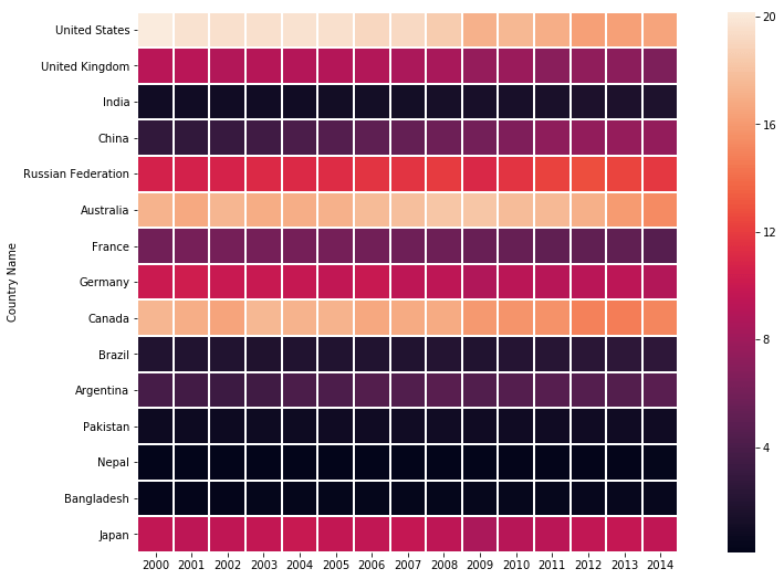
To show heatmap bigger we used matplotlib plt.figure() function and pass figure size value in ratio 16:9.
# Create heatmap

plt.figure(figsize=(16,9))

sns.heatmap(globalWarming_df)
Output >>>

sns.heatmap() vmin & vmax parameter
- vmin, vmax: Pass value as a float, optional
To set the limit of the colormap, change vmin and vmax value. It also set the lower and upper bound of the heatmap color bar. Here, we passed 0 value as lower bound and 21 as upper bound.
# vmin and vmax parameter set limit of colormap

plt.figure(figsize=(16,9))

sns.heatmap(globalWarming_df, vmin = 0, vmax = 21)
Output >>>

How to change seaborn heatmap color using cmap parameter?
- cmap: Pass value as a matplotlib colormap name or object, or list of colors, optional
To change the seaborn heatmap color, the sns.heatmap() cmap (colormap) parameter use. Here, we are passing ‘coolwarm’ colormap value to change the color of sns heatmap but you can pass any value. The list of cmap given below.
Colormap values:
Possible values are: Accent, Accent_r, Blues, Blues_r, BrBG, BrBG_r, BuGn, BuGn_r, BuPu, BuPu_r, CMRmap, CMRmap_r, Dark2, Dark2_r, GnBu, GnBu_r, Greens, Greens_r, Greys, Greys_r, OrRd, OrRd_r, Oranges, Oranges_r, PRGn, PRGn_r, Paired, Paired_r, Pastel1, Pastel1_r, Pastel2, Pastel2_r, PiYG,
PiYG_r, PuBu, PuBuGn, PuBuGn_r, PuBu_r, PuOr, PuOr_r, PuRd, PuRd_r, Purples, Purples_r, RdBu, RdBu_r, RdGy, RdGy_r, RdPu, RdPu_r, RdYlBu, RdYlBu_r, RdYlGn, RdYlGn_r, Reds, Reds_r, Set1, Set1_r, Set2, Set2_r, Set3, Set3_r, Spectral, Spectral_r, Wistia, Wistia_r, YlGn, YlGnBu, YlGnBu_r, YlGn_r,
YlOrBr, YlOrBr_r, YlOrRd, YlOrRd_r, afmhot, afmhot_r, autumn, autumn_r, binary, binary_r, bone, bone_r, brg, brg_r, bwr, bwr_r, cividis, cividis_r, cool, cool_r, coolwarm, coolwarm_r, copper, copper_r, cubehelix, cubehelix_r, flag, flag_r, gist_earth, gist_earth_r, gist_gray, gist_gray_r,
gist_heat, gist_heat_r, gist_ncar, gist_ncar_r, gist_rainbow, gist_rainbow_r, gist_stern, gist_stern_r, gist_yarg, gist_yarg_r, gnuplot, gnuplot2, gnuplot2_r, gnuplot_r, gray, gray_r, hot, hot_r, hsv, hsv_r, icefire, icefire_r, inferno, inferno_r, jet, jet_r, magma, magma_r, mako,
 mako_r, nipy_spectral, nipy_spectral_r, ocean, ocean_r, pink, pink_r, plasma, plasma_r, prism, prism_r, rainbow, rainbow_r, rocket, rocket_r, seismic, seismic_r, spring, spring_r, summer, summer_r, tab10, tab10_r, tab20, tab20_r, tab20b, tab20b_r, tab20c, tab20c_r, terrain, terrain_r,
twilight, twilight_r, twilight_shifted, twilight_shifted_r, viridis, viridis_r, vlag, vlag_r, winter, winter_r
# change heatmap color using cmap

plt.figure(figsize=(16,9))

sns.heatmap(globalWarming_df, cmap="coolwarm")
Output >>>

Change cmap using sns.heatmap() center parameter
- center: Pass value as a float, optional
In the above heatmap, we change the color of seaborn heatmap but center parameter will change cmap according to a given value by the creator.
# center parameter

plt.figure(figsize=(16,9))

sns.heatmap(globalWarming_df, cmap="coolwarm", center = 10.0)
Output >>>

How to remove vmin or vmax using sns.heatmap() robust parameter?
- robust: Pass value as a bool, optional
To remove the vmin or vmax or both from the color bar, pass ‘True‘ value to sns heatmap robust parameter. Then the colormap range is computed with robust quantiles instead of the extreme values.
# robust

plt.figure(figsize=(16,9))

sns.heatmap(globalWarming_df, robust = True)
Output >>>

Seaborn heatmap annot parameter – add a number on each cell
- annot: Pass value as a bool or rectangular dataset, optional
Each cell of python seaborn heatmap show by number and you want to show that number on cell then sns.heatmap() annot (annotation) parameter will help. We can show the original number of a particular cell or pass other values as your requirements.
When we pass bool ‘True‘ value to annot then the value will show on each cell of the heatmap.
# annot (annotate) parameter

plt.figure(figsize=(16,9))

sns.heatmap(globalWarming_df, annot = True)
Output >>>

Now, we are passing rectangular dataset means 2D numpy array to annot parameter.
# pass 2D Numpy array to annot parameter

annot_arr = np.arange(1,13).reshape(4,3) # create 2D numpy array with 4 rows and 3 columns

sns.heatmap(array_2d, annot= annot_arr)
Output >>>

If you are thinking, can we pass a string value to sns heatmap annot parameter then answer is no. To solve this problem heatmap introduce new parameter.
sns.heatmap() fmt parameter – add text on each cell
- fmt: Pass value as a string, optional
The annot only help to add numeric value on python heatmap cell but fmt parameter allows to add string (text) values on the cell.
Here, we created a 2D numpy array which contains string values and passes to annot along with that pass a string value “s” to fmt.
Note: If you will pass string values to annot without using fmt then the error will occur. The seaborn heatmap fmt help to show annot with different formatting.
# fmp parameter - add text on heatmap cell

annot_arr = np.array([['a00','a01','a02'],
                      ['a10','a11','a12'],
                      ['a20','a21','a22'],
                      ['a30','a31','a32']], dtype = str)

sns.heatmap(array_2d, annot = annot_arr, fmt="s") # s -string, d - decimal
Output >>>

How to change style & format of annot (annotate) using sns.heatmap() annot_kws?
- annot_kws: Pass value as dict of the key, value mappings, optional
Sometime annot and ftm parameter is not sufficient to show a heatmap meaningful and stylish. To solve this problem annot_kws means annotate keyword arguments change the style and format of annotating the text.
Here, we are passing some annotate keyword arguments but you can pass all ax.text or matplotlib.text arguments.
- fontsize: To change the size of the font
- fontstyle: To change the style of font like italic, oblique and normal
- fontfamily: To change the family of font like serif, cursive
- color: To change the color of font
- alpha: To change the transparency of the text
- rotation: To change the rotation of the text
- verticalalignment: To change the vertical alignment of the text like center, top, bottom, baseline, center_baseline
- backgroundcolor: To change the background color of the text
While passing annot_kws then annot value must be True.
# annot_kws parameter

plt.figure(figsize=(16,9))

annot_kws={'fontsize':10,
           'fontstyle':'italic',
           'color':"k",
           'alpha':0.6,
           'rotation':"vertical",
           'verticalalignment':'center',
           'backgroundcolor':'w'}

sns.heatmap(globalWarming_df, annot = True, annot_kws= annot_kws)
Output >>>

Separate each cell of a heatmap using sns.heatmap() linewidths parameter
- linewidths: Pass value like an int or float, optional
If you observe in all above heatmaps, you will face one issue to finding separate cell because of some cells value same that reason they are indistinguishable. In this situation, the linewidths parameter is your guide. It divides each cell by line.
# linewidths parameter - divede each cell of heatmap

plt.figure(figsize=(16,9))

sns.heatmap(globalWarming_df, linewidths=4)
Output >>>

Change the line color of seaborn heatmap with linecolor parameter
- linecolor: Pass color value as a string format, optional
Sometime seaborn heatmap linewidths parameter looks like failing to divide heatmap cell because of color complexity. So, linecolor parameter gives the flexibility to choose any color for the heatmap line.
Here, we are passing heatmap line color as black(k) and you must have to use linewidths parameter nothing it will not work.
# linecolor parameter - change the color of heatmap line

plt.figure(figsize=(16,9))

sns.heatmap(globalWarming_df, linewidths=4, linecolor="k")
Output >>>

How to hide color bar using sns.heatmap() cbar parameter?
- cbar: Pass value as a boolean, optional
We saw each and every time when the python heatmap create the color bar (cbar) also generate because of default cbar has bool True value. If we pass bool False value to seaborn heatmap color bar (cbar) parameter then the color bar will hide.
# hide color bar with cbar parameter

plt.figure(figsize=(16,9))

sns.heatmap(globalWarming_df, cbar = False)
Output >>>

How to change the color bar of seaborn heatmap?
- cbar_kws: Pass value as a dictionary (key and value pair), optional
The color bar is the most important part of the sns heatmap to know more about it but without modification sometimes the color bar is useless. This scenario, you will take help of sns.heatmap() cbar_kws parameter. Using color bar keyword arguments (cbar_kws) parameter, you can easily change the color bar passing multiple keyword arguments. The seaborn heatmap color bar allows matplotlib color bar parameters. Here, we use some of them.
- orientation: To change the ‘horizontal’ or ‘vertical’ orientation of the color bar
- shrink: To change the size of the color bar
- extend: To change the end of the color bar like pointed or not. If you want pointed color bar both side then passes value ‘both’, for left ‘min’ , right ‘max’ and ‘neither’ for no pointed color bar.
- extendfrac: To adjust the extension of the color bar. The ‘auto’ value adjust pointer automatically, ‘False’ value for no pointer and float value will help to adjust color bar pointer according to you.
- ticks: To change the ticks of the color bar, Pass list or numpy array of ticks
- drawedges: To draw lines (edges) on the color bar. Pass bool ‘True’ value for lines.
# change style and format of color bar with cbar_kws parameter

plt.figure(figsize=(14,14))

cbar_kws = {"orientation":"horizontal",
            "shrink":1,
            'extend':'min',
            'extendfrac':0.1,
            "ticks":np.arange(0,22),
            "drawedges":True,
           }

sns.heatmap(globalWarming_df, cbar_kws=cbar_kws)
Output >>>

How to set each cell of the seaborn heatmap in a square format?
- square: Pass value as a bool, optional
According to the size of 2- dimensional data the shape of sns heatmap define but we can set the shape of each cell of the heatmap in a square using sns.heatmap() square parameter by passing bool ‘True’ value.
# change the shape of each cell in a square with squre parameter

plt.figure(figsize=(16,9))

sns.heatmap(globalWarming_df, linewidths = 1, square= True)
Output >>>
Change x-axis labels or hide using sns.heatmap() xticklabels
- xticklabels: Pass value as an “auto”, bool, list-like, numpy array or int, optional
The python heatmap automatically gets x-axis label from columns name but we can change using sns.heatmap() xticklabels parameter. Also, hide x-axis labels passing the bool ‘False‘ value. Here, we are replacing x-axis labels [2000, 2001,…….,2014] by numpy array [0,1,…..,14].
# change x-axis labels using xticklabels parameter

plt.figure(figsize=(16,9))

sns.heatmap(globalWarming_df, xticklabels = np.arange(0,15))
Output >>>>

Change y-axis labels or hide using sns.heatmap() yticklabels
- yticklabels: Pass value as an “auto”, bool, list-like, numpy array or int, optional
Same like xticklabels, yticklabels also help to change or hide y-axis labels.
# change y-axis labels using yticklabels parameter

plt.figure(figsize=(16,9))

country_code = ['USA', 'GBR', 'IND', 'CHN', 'RUS', 'AUS', 'FRA', 'DEU', 'CAN', 'BRA', 'ARG', 'PAK', 'NPL', 'BGD', 'JPN']

sns.heatmap(globalWarming_df, yticklabels = country_code)
Output >>>

Heatmap without xticklabels, yticklabels and color bar – meaningless heatmap
If you want only color boxes or square then pass bool ‘False’ value to xticklabels, yticklabels, and cbar. Then you will get the only heatmap to look like a simple color box or you can say meaningless python heatmap.
# create square box

plt.figure(figsize=(10,8))

sns.heatmap(globalWarming_df, xticklabels = False, yticklabels = False, cbar=False, linecolor="w", linewidths=1)
Output >>>

Seaborn heatmap subplots – create multiple heatmaps
You want to create multiple heatmaps then use matplotlib plt.subplot() function is the best choice. Here, we are creating three python heatmaps by dividing plot in 1 row and 3 columns.
# multiple heatmaps using subplots

plt.figure(figsize=(30,10))

plt.subplot(1,3,1) # first heatmap
sns.heatmap(globalWarming_df,  cbar=False, linecolor="w", linewidths=1)

plt.subplot(1,3,2) # second heatmap
sns.heatmap(globalWarming_df,  cbar=False, linecolor="k", linewidths=1)

plt.subplot(1,3,3) # third heatmap
sns.heatmap(globalWarming_df,  cbar=False, linecolor="y", linewidths=1)

plt.show()
Output >>>

Set seaborn heatmap title, x-axis, y-axis label, font size with ax (Axes) parameter
- ax(Axes): matplotlib Axes, optional
The sns.heatmap() ax means Axes parameter help to set multiple things like heatmap title, x-axis, y-axis labels, and much more. Also, we set font size as 2, according to your requirements you can set it.
# set seaborn heatmap title, x-axis, y-axis label and font size

plt.figure(figsize=(16,9))

ax = sns.heatmap(globalWarming_df)

ax.set(title="Heatmap",
      xlabel="Years",
      ylabel="Country Name",)

sns.set(font_scale=2) # set fontsize 2
Output >>>

Seaborn heatmap keyword arguments (kwargs)
- kwargs: Pass other keyword arguments
The sns heatmap allows all keyword arguments of matplotlib ‘ax.pcolormesh’. Here, we used some kwargs like alpha, linewidth, linestyle, rasterized, edgecolor, capstyle, etc.
# Heatmap with keyword arguments (kwargs) parameter

plt.figure(figsize = (16,9))

kwargs = {'alpha':.9,'linewidth':10, 'linestyle':'--', 'rasterized':False, 'edgecolor':'w',  "capstyle":'projecting',}

ax = sns.heatmap(globalWarming_df,**kwargs)
Output >>>

How to create a seaborn heatmap using correlation matrix?
The main goal of python heatmap is to show the correlation matrix by data visualizing. When you want to find what’s the relationship between multiple features and which features are best for Machine Learning model building. Then take correlation of that dataset and visualize by sns heatmap. Here, we are taking the correlation of ‘globalWarming_df’ using DataFrame.corr() method and pass that correlation matrix to sns.heatmap() function. To show the correlation matrix on heatmap pass bool ‘True’ value to annot parameter.
# sns heatmap correlation

plt.figure(figsize=(16,9))

sns.heatmap(globalWarming_df.corr(), annot = True)
Output >>>

Upper triangle seaborn heatmap with mask
This is interesting to create the upper triangle sns heatmap and little complex to understand. We used numpy ‘.tril()’ method to take the upper correlation matrix and mask attribute. They help to create an upper triangle matrix.
# Upper triangle heatmap

plt.figure(figsize=(16,9))

corr_mx = globalWarming_df.corr() # correlation matrix

matrix = np.tril(corr_mx) # take lower correlation matrix

sns.heatmap(corr_mx, mask=matrix)
Output >>>

Lower triangle seaborn heatmap with mask
The same like upper triangle heatmap, we can create lower triangle seaborn heatmap. So, we used numpy ‘.triu()’ method to take a lower correlation matrix and mask attribute to create a lower triangle matrix.
# Lower triangle heatmap

plt.figure(figsize=(16,9))

corr_mx = globalWarming_df.corr() # correlation matrix

matrix = np.triu(corr_mx) # take upper correlation matrix

sns.heatmap(corr_mx, mask=matrix)
Output >>>

Seaborn heatmap examples for easy to use in the projects
1. Heatmap Example
# import libraries
import seaborn as sns # for data visualization
import matplotlib.pyplot as plt # for data visualization
import pandas as pd # for data analysis

# load dataset and create DataFrame ready to create heatmap
globalWarming_df = pd.read_csv("Who_is_responsible_for_global_warming.csv")
globalWarming_df = globalWarming_df.drop(columns=['Country Code', 'Indicator Name', 'Indicator Code'], axis=1).set_index('Country Name')

# set heatmap size
plt.figure(figsize= (16,9))

# create heatmap seaborn
sns.heatmap(globalWarming_df)

plt.title("Heatmap of 'Who is responsible for global warming'", fontsize = 25)
plt.xlabel("CO2 emissions (metric tons per capita) Per Year", fontsize = 20)
plt.ylabel("Country Name", fontsize = 20)
plt.show()
Output >>>

2. Heatmap Example
# import libraries
import seaborn as sns # for data visualization
import matplotlib.pyplot as plt # for data visualization
import pandas as pd # for data analysis

# load dataset and create DataFrame ready to create heatmap
globalWarming_df = pd.read_csv("Who_is_responsible_for_global_warming.csv")
globalWarming_df = globalWarming_df.drop(columns=['Country Code', 'Indicator Name', 'Indicator Code'], axis=1).set_index('Country Name')

# set heatmap size
plt.figure(figsize= (16,9))

# create heatmap seaborn

cbar_kws = {"orientation":"vertical",
            "shrink":1,
            'extend':'min',
            'extendfrac':0.1,
            "ticks":np.arange(0,22),
            "drawedges":True,
           } # color bar keyword arguments

sns.heatmap(globalWarming_df, vmin = 0, vmax = 21, cmap="coolwarm", annot = True, linewidth = 2, cbar_kws=cbar_kws)

plt.title("Heatmap of 'Who is responsible for global warming'", fontsize = 25)
plt.xlabel("CO2 emissions (metric tons per capita) Per Year", fontsize = 20)
plt.ylabel("Country Name", fontsize = 20)
plt.show()
Output >>>
3. Heatmap Example
# import libraries
import seaborn as sns # for data visualization
import matplotlib.pyplot as plt # for data visualization
import pandas as pd # for data analysis

# load dataset and create DataFrame ready to create heatmap
flights = sns.load_dataset("flights")
flights_df = flights.pivot("month", "year", "passengers")

# set heatmap size
plt.figure(figsize= (16,9))

# create heatmap seaborn

cbar_kws = {"shrink":.8,
           'extend':'both'}

sns.heatmap(flights_df, cmap="inferno", annot = True, fmt = 'd', linewidth = 2, cbar_kws=cbar_kws)

plt.title("Heatmap of 'Flights' Dataset", fontsize = 25)
plt.xlabel("Years", fontsize = 20)
plt.ylabel("Months", fontsize = 20)
plt.show()
Output >>>

4. Heatmap Example
# import libraries
import seaborn as sns # for data visualization
import matplotlib.pyplot as plt # for data visualization
import pandas as pd # for data analysis

# load dataset and create DataFrame ready to create heatmap
flights = sns.load_dataset("flights")
flights_df = flights.pivot("month", "year", "passengers")

# set heatmap size
plt.figure(figsize= (16,9))

# create heatmap seaborn

cbar_kws = {"shrink":.8,
           'extend':'max',
           'extendfrac':.2,
           "drawedges":True}

sns.heatmap(flights_df.corr(), cmap="inferno", annot = True, linewidth = 2, cbar_kws=cbar_kws)

plt.title("Heatmap Correlation of 'Flights' Dataset", fontsize = 25)
plt.xlabel("Years", fontsize = 20)
plt.ylabel("Months", fontsize = 20)
plt.show()
Output >>>

Conclusion
In the seaborn heatmap tutorial, we learn how to create a python seaborn heatmap with a real-time example using sns.heatmap() function. Along with that used different functions, parameter, and keyword arguments (kwargs). We suggest you make your hand dirty with each and every parameter of the above function because this is the best coding practice. Still, you didn’t complete matplotlib tutorial & seaborn tutorial then I recommend to you, catch it.
Keep in mind, mostly heatmap correlation use for feature selection from the dataset to build a Machine Learning model.
Download above seaborn Heatmap source code in Jupyter NoteBook file formate.